Easy Japanese
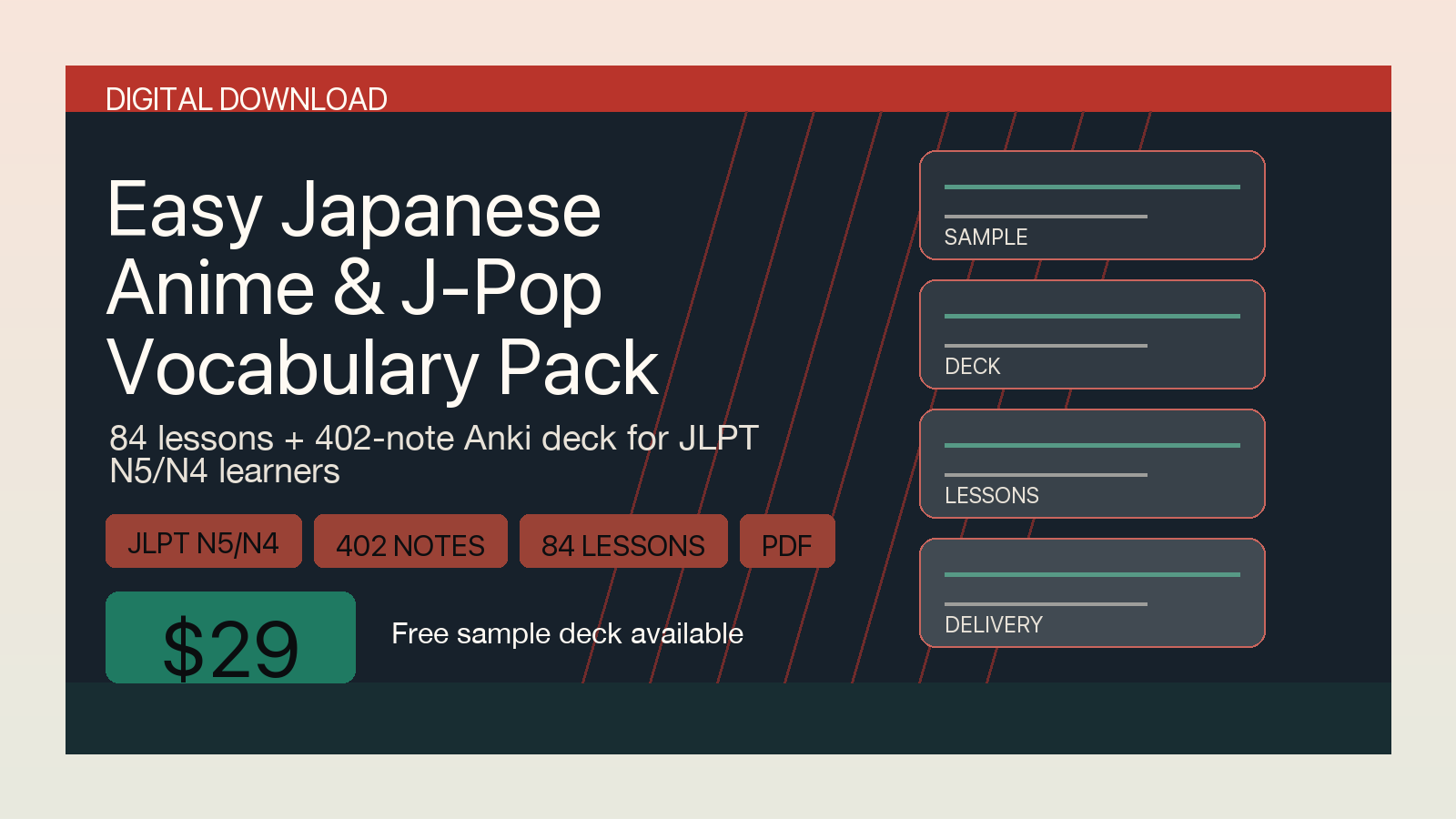
A learning-product identity balancing the energy of entertainment media with the clarity expected from study material. The system uses a compact red signal color, high-contrast typography, and repeatable lesson-card motifs.
Selected work / 2026
Product identity, launch artwork, and clear interfaces built to stay legible from a full landing page down to a tiny social avatar.
I work from the smallest real surface outward: favicon, avatar, thumbnail, product cover, and finally the complete page. The result is a visual system with enough character to be remembered and enough restraint to remain useful.
The projects below are live, public releases. Each combines visual direction with practical delivery across web, social, repository, and product surfaces.
A learning-product identity balancing the energy of entertainment media with the clarity expected from study material. The system uses a compact red signal color, high-contrast typography, and repeatable lesson-card motifs.
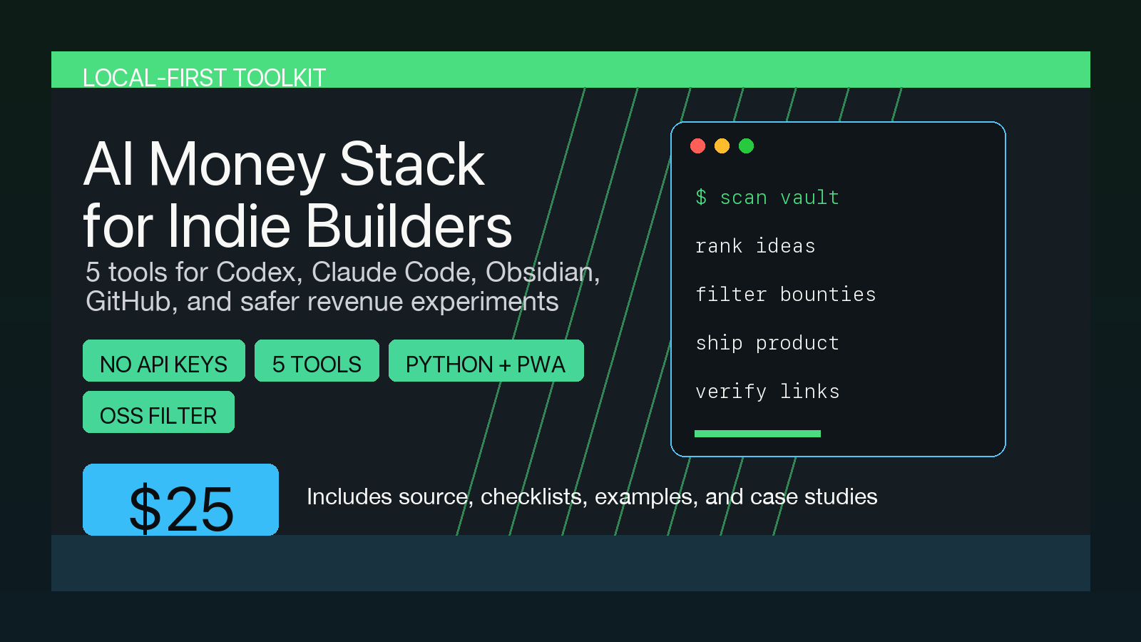
A technical product system that turns terminal language into a recognizable visual device. Mint signals, monospaced copy, and a framed command surface make the identity useful across covers, screenshots, documentation, and sales pages.
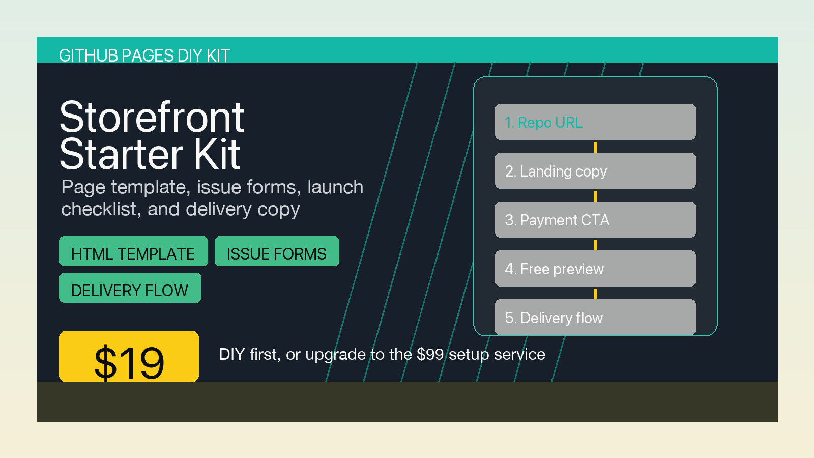
A practical identity for a static storefront toolkit. The visual language mirrors the five-step buyer journey, using bold yellow wayfinding and stable modular rows that remain readable in social previews and repository cards.
Available for selected commissions
Commission delivery can include concept directions, refinement rounds, optical testing at 16 to 128 pixels, and a clean source package. Exact scope, usage rights, schedule, and payment terms are agreed before kickoff.